SVM Margins Example
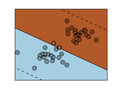
The plots below illustrate the effect the parameter C has on the seperation line. A large value of C basically tells our model that we do not have that much faith in our data’s distrubution, and will only consider points close to line of seperation.
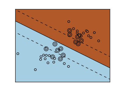
A small value of C includes more/all the observations, allowing the margins to be calculated using all the data in the area.
Python source code: plot_svm_margin.py
print __doc__


# Code source: Gael Varoqueux
# Modified for Documentation merge by Jaques Grobler
# License: BSD

import numpy as np
import pylab as pl
from sklearn import svm

# we create 40 separable points
np.random.seed(0)
X = np.r_[np.random.randn(20, 2) - [2,2], np.random.randn(20, 2) + [2, 2]]
Y = [0]*20 + [1]*20

# figure number
fignum = 1

# fit the model
for name, penality in (('unreg', 1), ('reg', 0.05)):

    clf = svm.SVC(kernel='linear', C=penality)
    clf.fit(X, Y)

    # get the separating hyperplane
    w =  clf.coef_[0]
    a = -w[0]/w[1]
    xx = np.linspace(-5, 5)
    yy = a*xx - (clf.intercept_[0])/w[1]

    # plot the parallels to the separating hyperplane that pass through the
    # support vectors
    margin = 1/np.sqrt(np.sum(clf.coef_**2))
    yy_down = yy + a*margin
    yy_up   = yy - a*margin

    # plot the line, the points, and the nearest vectors to the plane
    pl.figure(fignum, figsize=(4, 3))
    pl.clf()
    pl.set_cmap(pl.cm.Paired)
    pl.plot(xx, yy, 'k-')
    pl.plot(xx, yy_down, 'k--')
    pl.plot(xx, yy_up, 'k--')

    pl.scatter(clf.support_vectors_[:, 0], clf.support_vectors_[:, 1],
            s=80, facecolors='none', zorder=10)
    pl.scatter(X[:,0], X[:,1], c=Y, zorder=10)

    pl.axis('tight')
    x_min = -4.8
    x_max = 4.2
    y_min = -6
    y_max = 6

    XX, YY = np.mgrid[x_min:x_max:200j, y_min:y_max:200j]
    Z = clf.predict(np.c_[XX.ravel(), YY.ravel()])

    # Put the result into a color plot
    Z = Z.reshape(XX.shape)
    pl.figure(fignum, figsize=(4, 3))
    pl.set_cmap(pl.cm.Paired)
    pl.pcolormesh(XX, YY, Z)

    pl.xlim(x_min, x_max)
    pl.ylim(y_min, y_max)

    pl.xticks(())
    pl.yticks(())
    fignum = fignum + 1

pl.show()